```{r setup, include=FALSE}
require(Hmisc)
require(qreport)
hookaddcap() # make knitr call a function at the end of each chunk
# to try to automatically add to list of figure
options(prType='html')
getRs('qbookfun.r')
knitr::set_alias(w = 'fig.width', h = 'fig.height',
cap = 'fig.cap', scap ='fig.scap')
```
`r apacue <- 0`
# Transformations, Measuring Change, and Regression to the Mean {#sec-change}
`r mrg(ddisc(16))`
## Transformations
`r mrg(sound("change-1"))`
* Need to transform continuous variables properly for parametric
statistical methods to work well
* Normality assumption often does not hold and the central limit
theorem is irrelevant for non-huge datasets
+ Skewed distribution
+ Different standard deviation in different groups
* Transforming data can be a simple method to overcome these problems
* Non-parametric methods (Wilcoxon signed rank, Wilcoxon rank sum) another good option
* Transformations are also needed when you combine variables
+ subtraction as with change scores
+ addition (e.g. don't add ratios that are not proportions)
## Logarithmic Transformation
`r mrg(sound("change-2"))`
* Replace individual value by its logarithm
+ $u = \log(x)$
* In statistics, always use the \textit{natural} logarithm (base $e$; $ln(x)$)
* Algebra reminders
+ $\log(ab) = \log(a) + \log(b)$
+ $\log\left(\frac{a}{b}\right) = \log(a) - \log(b)$
+ Inverse of the log function is $\exp(u) = x$, where $\exp(u) = e^{u}$ and $e$ is a constant ($e = 2.718282 ...$)
### Example Dataset
`r mrg(sound("change-3"))`
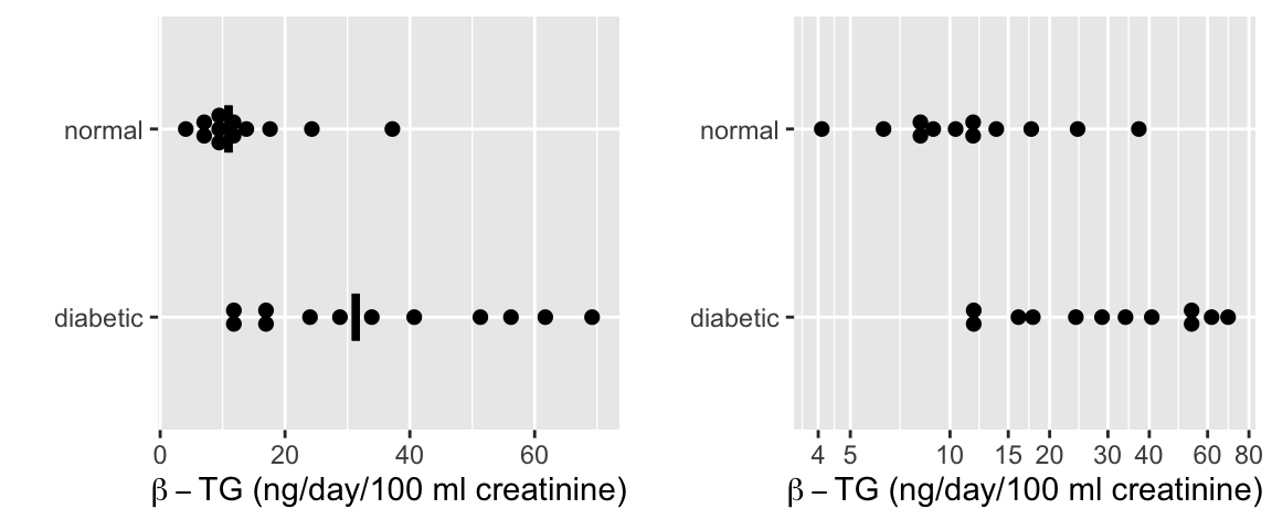
* From Essential Medical Statistics, 13.2 (pre data only)
* Response: Urinary $\beta$-thromboglobulin ($\beta$-TG) excretion in 24 subjects
* 24 total subjects: 12 diabetic, 12 normal
```{r w=6,h=2.5,cap='$\\beta$-TG levels by diabetic status with a median line. The left plot is on the original (non-transformed) scale and includes median lines. The right plot displays the data on a log scale.',scap='$\\beta$-TG levels by diabetic status'}
#| label: fig-change-diabetes
d <- rbind(
  data.frame(status='normal',
             btg=c(4.1, 6.3, 7.8, 8.5, 8.9, 10.4, 11.5, 12.0, 13.8,
                   17.6, 24.3, 37.2)),
  data.frame(status='diabetic',
             btg=c(11.5, 12.1, 16.1, 17.8, 24.0, 28.8, 33.9, 40.7,
                   51.3, 56.2, 61.7, 69.2)))
require(ggplot2)
require(data.table)
d <- data.table(d)
meds <- d[, .(btg = median(btg)), by = status]
p1 <-
  ggplot(d, aes(x=status, y=btg)) +
  geom_dotplot(binaxis='y', stackdir='center', position='dodge') +
  geom_errorbar(aes(ymin=..y.., ymax=..y..), width=.25, size=1.3, data=meds) +
   xlab('') + ylab(expression(paste(beta-TG, ' (ng/day/100 ml creatinine)'))) +
  coord_flip()
p2 <- ggplot(d, aes(x=status, y=btg)) +
  scale_y_log10(breaks=c(4,5,10,15,20,30,40,60,80)) +
  geom_dotplot(binaxis='y', stackdir='center', position='dodge') +
  xlab('') + ylab(expression(paste(beta-TG, ' (ng/day/100 ml creatinine)'))) +
  coord_flip()
arrGrob(p1, p2, ncol=2)
```
* Original scale
`r mrg(sound("change-4"))`
+ Normal: $\overline{x}_1 = 13.53$, $s_1 = 9.194$, $n_1 = 12$
+ Diabetic: $\overline{x}_2 = 35.28$, $s_2 = 20.27$, $n_2 = 12$
* Logarithm scale
+ Normal: $\overline{x}_1^* = 2.433$, $s_1^* = 0.595$, $n_1 = 12$
+ Diabetic: $\overline{x}_2^* = 3.391$, $s_2^* = 0.637$, $n_2 = 12$
* $t$-test on log-transformed data
+ $s_{pool} = \sqrt{\frac{11 \times .595^2 + 11 \times .637^2}{22}} = 0.616$
+ $t = \frac{2.433-3.391}{0.616\sqrt{1/12 + 1/12)}} = -3.81$, $\textrm{df} = 22$, $p = 0.001$
* Confidence Intervals (0.95 CI)
+ Note that $t_{.975,22} = 2.074$
+ For Normal subjects, a CI for the mean log $\beta$-TG is
$$\begin{array}{ccc}
0.95 \textrm{ CI } & = & 2.433 - 2.074 \times \frac{0.595}{\sqrt{12}} \textrm{ to } 2.433 + 2.074 \frac{0.595}{\sqrt{12}} \\
& = & 2.08 \textrm{ to } 2.79
\end{array}$$
+ Can transform back to original scale by using the antilog function $\exp(u)$ to estimate <b>medians</b>
$$\begin{array}{ccc}
\textrm{Geometric mean} & = & e^{2.433} = 11.39 \\
0.95 \textrm{ CI } & = & e^{2.08} \textrm{ to } e^{2.79} \\
& = & 7.98 \textrm{ to } 16.27 \\
\end{array}$$
```{r diabetest}
t.test(btg ~ status, data=d)
t.test(log(btg) ~ status, data=d)
```
* Could also use a non-parametric test (Wilcoxon rank sum)
```{r diabetesw}
wilcox.test(btg ~ status, data=d)
wilcox.test(log(btg) ~ status, data=d)
```
* Note that non-parametric test is the same for the log-transformed outcomes
### Limitations of log transformations
`r mrg(sound("change-5"))`
* Can only be used on positive numbers
+ Sometimes use $u = \log(x+1)$
* Is very arbitrary to the choice of the origin
* Not always useful or the best transformation
* Sometimes use a dimensionality argument, e.g., take cube root of volume measurements or per unit of volume counts like blood counts
* Cube and square roots are fine with zeros
## Analysis of Paired Observations
`r mrg(sound("change-6"))`
* Frequently one makes multiple observations on same experimental unit
* Can't analyze as if independent
* When two observations made on each unit (e.g., pre--post), it is common to summarize each pair using a measure of effect $\rightarrow$ analyze effects as if (unpaired) raw data
* Most common: simple difference, ratio, percent change
* Can't take effect measure for granted
* Subjects having large initial values may have largest differences
* Subjects having very small initial values may have largest post/pre ratios
## What's Wrong with Change in General? {#sec-change-gen}
`r quoteit('Not only is change from baseline a very problematic response variable; the very notion of patient improvement as an outcome measure can even be misleading. A patient who starts at the best level and who does not worsen should be considered a success.')`
### Change from Baseline in Randomized Studies {#sec-change-rct}
`r mrg(sound("change-7"))`
Many authors and pharmaceutical clinical trialists make the mistake of analyzing change from baseline instead of making the raw follow-up measurements the primary outcomes, covariate-adjusted for baseline. The purpose of a parallel-group randomized clinical trial is to compare the parallel groups, not to compare a patient with herself at baseline. The central question is for two patients with the same pre measurement value of x, one given treatment A and the other treatment B, will the patients tend to have different post-treatment values? This is exactly what analysis of covariance assesses. Within-patient change is affected strongly by regression to the mean and measurement error. When the baseline value is one of the patient inclusion/exclusion criteria, the only meaningful change score requires one to have a second baseline measurement post patient qualification to cancel out much of the regression to the mean effect. It is the second baseline that would be subtracted from the follow-up measurement.
The savvy researcher knows that analysis of covariance is required to "rescue" a change score analysis. This effectively cancels out the change score and gives the right answer even if the slope of post on pre is not 1.0. But this works only in the linear model case, and it can be confusing to have the pre variable on both the left and right hand sides of the statistical model. And if $Y$ is ordinal but not interval-scaled, the difference in two ordinal variables is no longer even ordinal. Think of how meaningless difference from baseline in ordinal pain categories are. A major problem in the use of change score summaries, even when a correct analysis of covariance has been done, is that many papers and drug product labels still quote change scores out of context. Patient-reported outcome scales with floor or ceiling effects are particularly problematic. Analysis of change loses the opportunity to do a robust, powerful analysis using a covariate-adjusted ordinal response model such as the proportional odds or proportional hazards model. Such ordinal response models do not require one to be correct in how to transform $Y$.
Not only is it very problematic to analyze change scores in parallel
group designs; it is problematic to even compute them. To compute
change scores requires many assumptions to hold, e.g.:
`r mrg(sound("change-8"))`
1. the variable is not used as an inclusion/exclusion criterion for the study, otherwise regression to the mean will be strong
1. if the variable is used to select patients for the study, a second post-enrollment baseline is measured and this baseline is the one used for all subsequent analysis
1. the post value must be linearly related to the pre value
1. the variable must be perfectly transformed so that subtraction "works" and the result is not baseline-dependent
1. the variable must not have floor and ceiling effects
1. the variable must have a smooth distribution
1. the slope of the pre value vs. the follow-up measurement must be close to 1.0 when both variables are properly transformed (using the same transformation on both)
References may be found [here](https://hbiostat.org/bib/change.html), and also see [this tutorial](https://github.com/CRFCSDAU/EH6126_data_analysis_tutorials/blob/master/Unit_1_Review/Change_scores/Change_scores.md).
Regarding 3. above, if pre is not linearly related to post, there is
`r mrg(sound("change-9"))`
no transformation that can make a change score work. Two unpublished
examples illustrate this problem. The first is detailed in @sec-change-ex.
Briefly, in a large depression study using
longitudinal measurements of the Hamilton-D depression scale, there
was a strong nonlinear relationship between baseline Hamilton D and
the final measurement. The form of the relationship was a flattening
of the effect for larger Ham D, indicating there are patients with
severe depression at baseline who can achieve much larger reductions
in depression than an average change score would represent (and
likewise, patients with mild to moderate depression at baseline would
have a reduction in depression symptoms that is far less than the
average change indicates). Doing an ordinal ANCOVA adjusting for a
smooth nonlinear effect of baseline using a spline function would have
been a much better analysis than the change from baseline analysis
done by study leaders. In the second example, a similar result was
found for a quality of life measure, KCCQ. Similar to the depression trial example, a flattening
relationship for large KCCQ indicated that subtracting from baseline
provided a nearly meaningless average change score.
Regarding 7. above, often the baseline is not as relevant as thought and the slope will be less than 1. When the treatment can cure every patient, the slope will be zero. When the baseline variable is irrelevant, ANCOVA will estimate a slope of approximately zero and will effectively ignore the baseline. Change will baseline will make the change score more noisy than just analyzing the final raw measurement. In general, when the relationship between pre and post is linear, the correlation between the two must exceed 0.5 for the change score to have lower variance than the raw measurement.
@bla11com have an excellent [article](https://www.ncbi.nlm.nih.gov/pmc/articles/PMC3286439) about how misleading change from baseline is for clinical trials. [This](http://www.fharrell.com/post/errmed#change) blog article has several examples of problematic change score analyses in the clinical trials literature.
#### Nearly Optimal Statistical Model {#sec-change-opmod}
* Suppose $Y$ = 0-20 (worst - best) with many ties at 20 (ceiling effect)
* Baseline value $y_0$
* $Y - y_{0}$ and linear model residuals will have striped patterns
* Change score fails to give credit to a patient who starts at $y_0$=19 or 20 and doesn't worsen
* $y_{0} = Y = 20 \rightarrow$ great outcome
* Semiparametric ordinal model allows for floor and ceiling effects and arbitrary $Y$ distribution
* Allow flexibility in shape of effect of $y_0$ on $Y$
* Proportional odds model starts with treatment odds ratio which is [convertible to a Wilcoxon statistic concordance probability](https://fharrell.com/post/powilcoxon)
* Model can also estimate
+ $\Pr(Y \geq y | y_{0}, \text{treatment})$
+ mean and quantiles of $Y$ as a function of $y_0$ and treatment
+ mean and quantiles of $Y - y_{0}$ as a function of $y_{0}$
The following `R` code exemplifies how to do a powerful, robust
analysis with a likely-to-fit model, without computing change from baseline. This analysis
addresses the fundamental treatment question posed at the top of this
section. This example uses a semiparametric ANCOVA that utilizes only
the ranks of $Y$ and that provides the same test statistic no matter
how $Y$ is transformed. It uses the proportional odds model, with no
binning of $Y$, using the `rms` package `orm`
function\footnote{`orm` can easily handle thousands of intercepts
(thousands of distinct $Y$ values).}. This is a generalization of
the Wilcoxon test---it would be almost identical to the Wilcoxon test
had the baseline effect been exactly flat. Note that the proportional
odds assumption is more likely to be satisfied than the normal
residual, equal variance assumption of the ordinary linear model.
`r mrg(sound("change-10"))`
```{r orm, eval=FALSE}
require(rms)
# Fit a smooth flexible relationship with baseline value y0
# (restricted cubic spline function with 4 default knots)
f <- orm(y ~ rcs(y0, 4) + treatment)
f
anova(f)
# Estimate mean y as a function of y0 and treatment
M <- Mean(f)   # creates R function to compute the mean
plot(Predict(f, treatment, fun=M))  # y0 set to median since not varied
# To allow treatment to interact with baseline value in a general way:
f <- orm(y ~ rcs(y0, 4) * treatment)
plot(Predict(f, y0, treatment))  # plot y0 on x-axis, 2 curves for 2 treatments
# The above plotted the linear predictor (log odds); can also plot mean
```
Kristoffer Magnusson has an excellent paper
[Change over time is not "treatment response"](http://rpsychologist.com/treatment-response-subgroup)
@sensta Chapter 7 has a very useful graphical
summary of the large-sample variances (inefficiency) of change scores
vs. ANCOVA vs. ignoring baseline completely, as a function of the
(assumed linear) correlation between baseline and outcome.
`r mrg(sound("change-11"))`
<img src="images/sennChange.jpg" width="70%">
### Example of a Misleading Change Score {#sec-change-ex}
As discussed above, for a change from baseline to be meaningful, the relationship between baseline and follow-up measurements must be linear with a slope of 1.0.[This is despite the fact that adjusting for baseline can rescue a **linear** model. Researchers are routinely quoting out-of-context mean change scores that are very hard to interpret when linearity and a slope of 1.0 do not hold.]{.aside} Otherwise the amount of change will be baseline-dependent. Consider a real example taken from a randomized clinical trial of an anti-depressive medication. [The data from the actual trial were perturbed for confidentiality reasons. The amount of perturbation makes the original data not identifiable but preserves the relationships among variables.]{.aside} The [Hamilton-D depression scale](https://en.wikipedia.org/wiki/Hamilton_Rating_Scale_for_Depression) was assessed at baseline and 8 weeks after randomization in this two-arm parallel-group randomized trial. The dataset `hamdp` is available from [hbiostat.org/data](https://hbiostat.org/data) by using the R `Hmisc` package `getHdata` function.
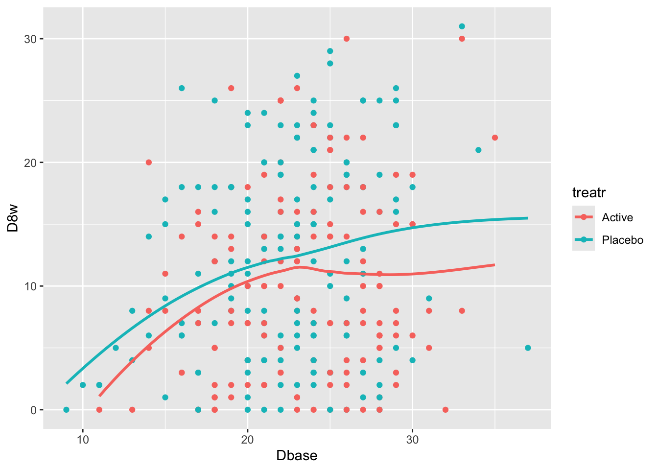
Start with plotting the raw data and adding nonparametric smoothers.
```{r}
#| label: fig-change-hamd
#| fig-cap: "8w vs. baseline Hamilton-D depression scores along with _loess_ nonparametric smoothers by treatment"
getHdata(hamdp)
h <- hamdp
ggplot(h, aes(x=Dbase, y=D8w, color=treatr)) + geom_point() + geom_smooth(span=1, se=FALSE)
```
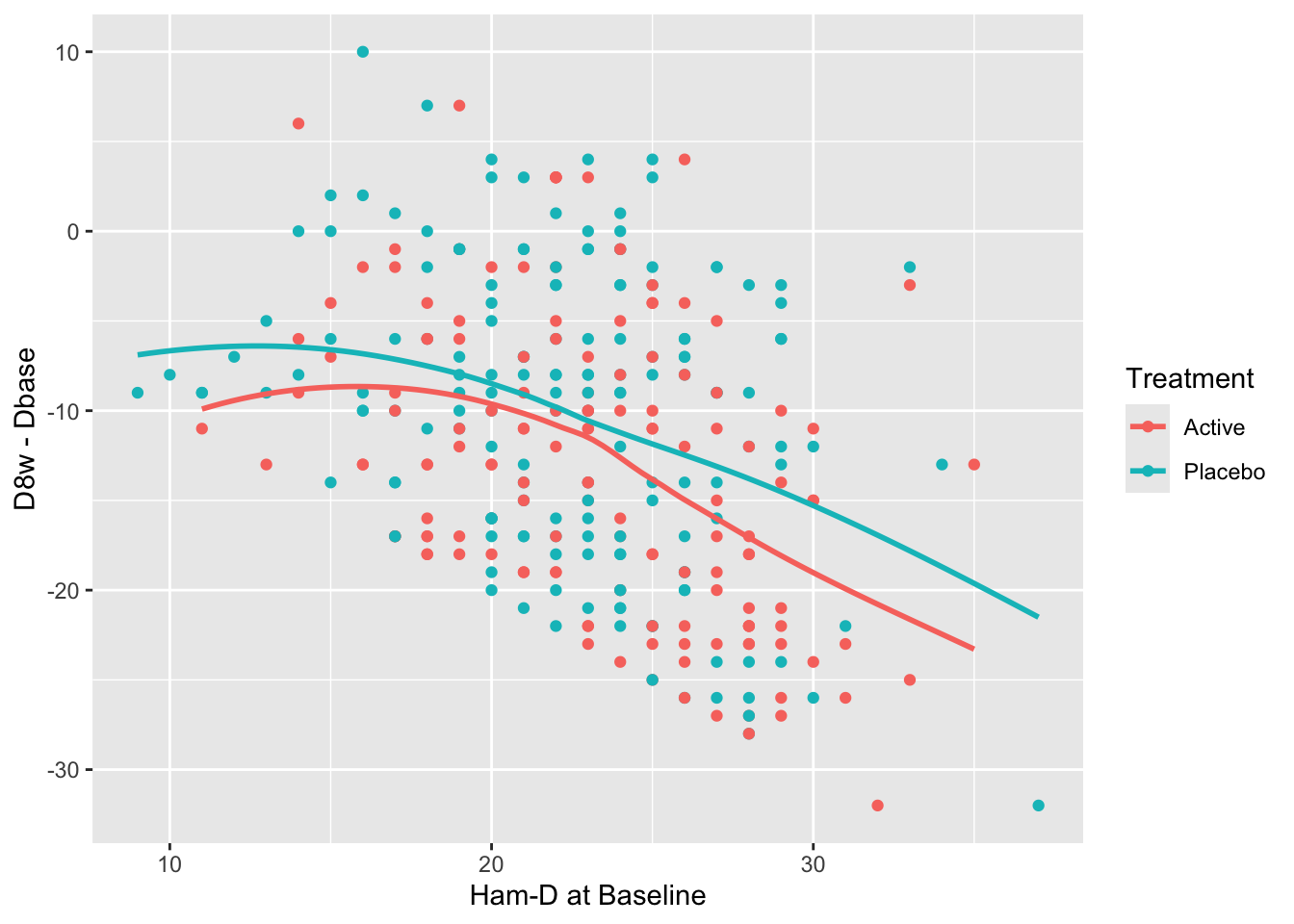
Relationships are not linear due to the fact that patients with more severe depression symptoms at baseline had the greatest reduction in symptoms. Those with mild to moderate depression had less room to move. See how this affects change from baseline.
```{r}
#| label: fig-change-hamdd
#| fig-cap: "Change from baseline at 8w vs. baseline Hamilton-D depression scores and _loess_ nonparametric smoothers by treatment"
ggplot(h, aes(x=Dbase, y=D8w - Dbase, color=treatr)) + geom_point() + geom_smooth(span=1, se=FALSE)
```
There is a strong relationship between baseline and change from baseline for both treatments. Computing the average change score ignoring baseline results in a meaningless estimate.
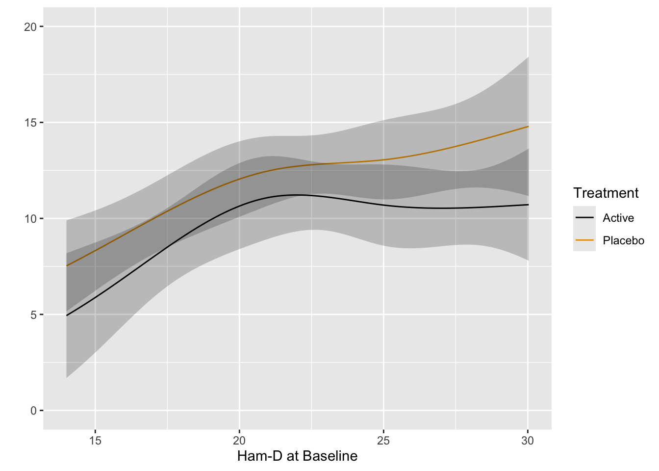
Fit the preferred model---one that allows for floor and ceiling effects and does not assume a distribution for Hamilton-D---the proportional odds (PO) model. Allow baseline to have a smooth nonlinear effect through the use of a restricted cubic spline function with 4 knots, and allow the shape of this effect to differ by treatment. Use the PO model to estimate the mean 8w Hamilton-D as a function of baseline and treatment.
```{r}
require(rms)
dd <- datadist(h); options(datadist='dd')   # needed by rms package
f  <- orm(D8w ~ rcs(Dbase, 4) * treatr, data=h)
f
anova(f)
```
The ANOVA table shows very little evidence for a treatment $\times$ baseline interaction. Plot predicted means from this model. [If the interaction is removed from the model, the $P$-value for treatment is 0.01.]{.aside}
```{r}
#| label: fig-change-hamdorm
#| fig-cap: "Estimated mean Hamilton-D score at 8w using the proportional odds model, allowing for nonlinear and interaction effects. The fitted spline function does more smoothing than the earlier _loess_ estimates."
p <- Predict(f, Dbase, treatr, fun=Mean(f))
ggplot(p)
```
Use the PO model to estimate the difference in means. [Confidence intervals for differences in means from semiparametric models are not provided by the `rms` package. You can use the `rmsb` package in conjuction with the `rms` `contrast` function to get exact Bayesian uncertainty intervals for such differences.]{.aside}
```{r}
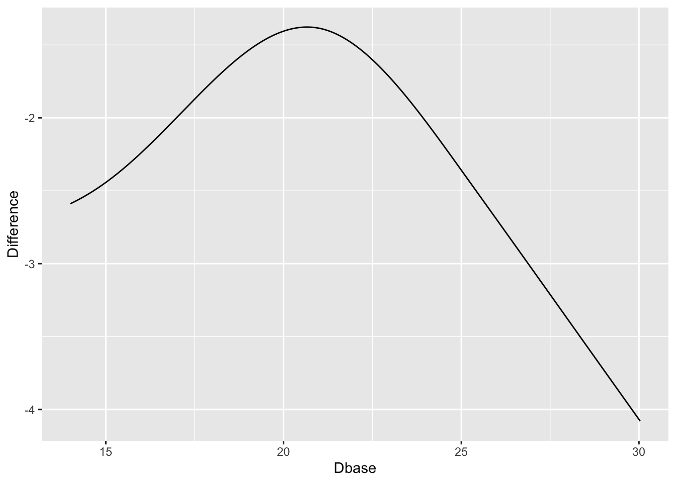
#| label: fig-change-hamdorm2
#| fig-cap: "Estimated treatment difference in mean Ham-D allowing for interaction, thus allowing for non-constant differences. Keep in mind the slight evidence for non-constancy (interaction)."
w <- data.frame(Dbase      = p$Dbase[p$treatr=='Active'],
                Difference = p$yhat[p$treatr=='Active'] -
                             p$yhat[p$treatr=='Placebo'])
ggplot(w, aes(x=Dbase, y=Difference)) + geom_line()
```
`r quoteit('When baseline severity was used as the only covariate, improvement with drug and placebo increased with greater baseline severity ... The advantage of drug over placebo increased with baseline severity by 0.09 points (95% confidence interval 0.06 to 0.12) for every one point increase in severity. The estimated difference between drug and placebo at a baseline severity of 16 points (5th centile) was 1.1 points, increasing to 2.5 points at a baseline severity of 29.6 points (95th centile).', '[Stone et al](https://www.bmj.com/content/378/bmj-2021-067606)')`
::: {.callout-note collapse="true"}
## Estimates from an Ordinary Linear Model
Just for comparisons with the estimated means from the PO model, here are estimates using ordinary least squares.
```{r}
f <- ols(D8w ~ rcs(Dbase, 4) * treatr, data=h)
f
anova(f)
ggplot(Predict(f, Dbase, treatr, conf.int=FALSE))
```
:::
### KCCQ Ceiling Effect {#sec-change-kccq}
Consider data from Vanderbilt University Medical Center cardiologist Brian Lindman from his Doris Duke funded TAVR cohort. The data contain KCCQ (Kansas City Quality of Life) scores obtained in patients with severe aortic stenosis prior to transcatheter aortic valve implantation (baseline) and 1 year after the procedure. The KCCQ is a heart failure specific health status measurement based on responses to 12 questions.
```{r}
#| fig-width: 5.5
#| fig-height: 4
k <- read.csv('kccq.csv')
ggplot(k, aes(kccq0, kccq1, color=tx)) + geom_point() +
  xlab('Baseline KCCQ') + ylab('KCCQ at 1y')
```
The problem that KCCQ creates for change scores is due to a ceiling effect around the best value of 100. There is less room to move when the baseline values are > 80. Change scores do not give credit to a patient who begins high and does not deteriorate. And change scores can cause major violations of assumptions needed for standard linear models, as shown in the non-constant variance and non-normality below.
```{r}
#| fig-height: 3
#| fig-width: 7
par(mgp = c(1.5, 0.5, 0), mar = c(2.5, 2.5, 2, 1) + 0.1, tck = -0.02,
    cex.axis = 0.8, bty = "l", mfrow=c(1,2))
f <- lm(kccq1 ~ kccq0 + tx, data=k, na.action=na.exclude)
with(k, plot(fitted(f), resid(f)))
qqnorm(resid(f), main='')
qqline(resid(f))
```
See [this](https://fharrell.com/post/pop) for another KCCQ example where the slope of post vs. pre is far from 1.0, and an example using the cardiac biomarker BNP where post vs. pre is far from linear.
### Special Problems Caused By Non-Monotonic Relationship With Ultimate Outcome {#sec-change-anova}
Besides the strong assumptions made about how variables are
transformed before a difference is calculated, there are many types of
variables for which change can never be interpreted without reference
to the starting point, because the relationship between the variable
in question and an ultimate outcome is not even monotonic. A good
example is the improper definitions of acute kidney injury (AKI) that have
been accepted without question. Many of the definitions are based on
change in serum creatinine (SCr). Problems with the definitions include
1. The non-monotonic relationship between SCr and mortality demonstrates that it is not healthy to have very low SCr. This implies that increases in SCr for very low starting SCr may not be harmful as assumed in definitions of AKI.
1. Given an earlier SCr measurement and a current SCr, the earlier measurement is not very important in predicting mortality once one adjusts for the last measurement. Hence a change in SCr is not very predictive and the current SCr is all-important.
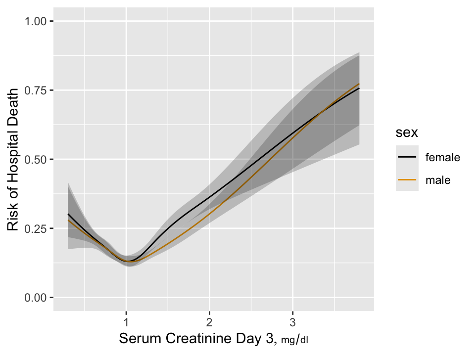
As an example consider the estimated relationship between baseline SCr
and mortality in critically ill ICU patients.
```{r w=5,h=3.75,cap='Estimated risk of hospital death as a function of day 3 serum creatinine and sex for 7772 critically ill ICU patients having day 1 serum creatinine $< 2$ and surviving to the start of day 3 in the ICU',scap='Hospital death as a function of creatinine'}
#| label: fig-change-suppcr
require(rms)
load('~/i/Analyses/SUPPORT/combined.sav')
combined <- subset(combined,
  select=c(id, death, d.time, hospdead, dzgroup, age, raceh, sex))
load('~/i/Analyses/SUPPORT/combphys.sav')
combphys <- subset(combphys, !is.na(crea1+crea3),
                   select=c(id,crea1,crea3,crea7,crea14,crea25,alb3,
                     meanbp3,pafi3,wblc3))
w <- merge(combined, combphys, by='id')
u <- 'mg/dl'
w <- upData(w, labels=c(crea1='Serum Creatinine, Day 1',
                 crea3='Serum Creatinine Day 3',
                 crea14='Serum Creatinine Day 14'),
            units=c(crea1=u, crea3=u, crea7=u, crea14=u, crea25=u),
            print=FALSE)

w <- subset(w, crea1 < 2)
dd <- datadist(w); options(datadist='dd')
h <- lrm(hospdead ~ rcs(crea1, 5) + rcs(crea3, 5), data=w)
anova(h)
h <- lrm(hospdead ~ sex * rcs(crea3, 5), data=w)
p <- Predict(h, crea3, sex, fun=plogis)
ggplot(p, ylab='Risk of Hospital Death')
```
`r mrg(sound("change-12"))`
We see that the relationship is very non-monotonic so that it is
impossible for change in SCr to be relevant by itself unless the study
excludes all patients with SCr $< 1.05$. To put this in perspective,
in the NHANES study of asymptomatic subjects, a very significant
proportion of subjects have SCr $< 1$.
### Current Status vs. Change {#sec-change-current}
In most cases, change from baseline does not even answer the right question. Unlike analysis of covariance on the final response adjusted for baseline, change from baseline is a response variable that most patients find to be irrelevant. This is because for most diseases patients care most about their current status and little about how they got there. Consider patient outcomes and satisfaction with their outcomes after [spine surgery for lumbar degenerative disease](https://www.thespinejournalonline.com/article/S1529-9430(17)30233-4/fulltext) by @cho17eff.
In this study the Oswestry Disability Index (ODI) was assessed at baseline and at 12 months following surgery, and satisfaction with outcomes of spine surgery was also assessed at 12 months. ODI is a 0-100 scale measuring back-related functional status and response to treatment. Satisfaction was assessed using a four-point scale and aimed at gauging "the degree to which a patient feels that they have achieved the highest quality of care." Satisfaction levels were defined as
1. Surgery met my expectations.
1. I did not improve as much as I had hoped but I would undergo the same operation for the same results.
1. Surgery helped but I would not undergo the same operation for the same results.
1. I am the same or worse as compared to before surgery.
The respective proportions of patients in each satisfaction category were 0.64, 0.21, 0.06, and 0.09.
The satisfaction outcome gives much weight to the patient's perceived change in status, making the following results even more convincing.
The authors did a simple analysis that is neglected by most authors: Use both the baseline and 12-month ODI to predict 12-month satisfaction with surgical outcomes, analyzed with a proportional odds ordinal logistic model. Such an analysis allows the data to speak to us without injecting any prior bias. If relationships with outcome are linear and the coefficients of baseline and 12m ODI are equal in magnitude but have opposite signs, then the change in functional status is the best way to capture patients' ultimate satisfaction with care. Instead of that, ODI at 12m explained 0.86 of the total ordinal model $\chi^2$, and baseline ODI explained only 0.05 of the total explainable variation in 12m satisfaction. Combined with age, sex, education, occupation, dominant symptom, diagnosis, coronary disease, and ambulation, baseline ODI still only explained 0.09 of the total model $\chi^2$.
The near irrelevance of baseline state is shown in Figure 3 of @cho17eff reproduced below. The hue represents the degree of satisfaction. Differences in hues are almost undetectable when moving from left to right across baseline ODI levels. Moving from bottom to top across levels of 12m ODI, differences in satisfaction are apparent.
<img src="images/cho17effFig3.png" width="100%">
Analyses such as this support the use of absolute current status as endpoints in clinical trials and as basis for modeling outcomes. This is completely consistent with using ANCOVA as described in @sec-change-rct where one answers the most relevant question: Do patients on different treatments end up differently if they started the same? ANCOVA allows for regression to the mean and even allows the baseline status to be irrelevant.
## What's Wrong with Percent Change?
`r mrg(sound("change-13"))`
* Definition
$$
\% \textrm{ change } = \frac{\textrm{first value} - \textrm{second value}}{\textrm{second value}} \times 100
$$
* The first value is often called the new value and the second value is called the old value, but this does not fit all situations
* Example
+ Treatment A: 0.05 proportion having stroke
+ Treatment B: 0.09 proportion having stroke
* The point of reference (which term is used in the denominator?) will impact the answer
+ Treatment A reduced proportion of stroke by 44\
+ Treatment B increased proportion by 80\
* Two increases of 50\% result in a total increase of 125\%, not 100\
+ Math details: If $x$ is your original amount, two increases of 50\% is $x\times 1.5\times 1.5$. Then, \% change = $(1.5\times 1.5\times x - x) / x = x\times (1.5\times 1.5 - 1) / x = 1.25$, or a 125\% increase
* Percent change (or ratio) not a symmetric measure
+ A 50\% increase followed by a 50\% decrease results in an overall decrease (not no change)
- Example: 2 to 3 to 1.5
+ A 50\% decrease followed by a 50\% increase results in an overall decrease (not no change)
- Example: 2 to 1 to 1.5
* Unless percents represent proportions times 100, it is not appropriate to compute descriptive statistics (especially the mean) on percents.
+ For example, the correct summary of a 100\% increase and a 50\% decrease, if they both started at the same point, would be 0\% (not 25\%).
* Simple difference or log ratio are symmetric
See also [fharrell.com/post/percent](http://fharrell.com/post/percent)
## Objective Method for Choosing Effect Measure
`r mrg(sound("change-14"))`
* Goal: Measure of effect should be as independent of baseline value as possible^[Because of regression to the mean, it may be impossible to make the measure of change truly independent of the initial value. A high initial value may be that way because of measurement error. The high value will cause the change to be less than it would have been had the initial value been measured without error. Plotting differences against averages rather than against initial values will help reduce the effect of regression to the mean.]
* Plot difference in pre and post values vs. the pre values. If this shows no trend, the simple differences are adequate summaries of the effects, i.e., they are independent of initial measurements.
* If a systematic pattern is observed, consider repeating the previous step after taking logs of both the pre and post values. If this removes any systematic relationship between the baseline and the difference in logs, summarize the data using logs, i.e., take the effect measure as the log ratio.
* Other transformations may also need to be examined
## Example Analysis: Paired Observations
`r mrg(sound("change-15"))`
### Dataset description
* Dataset is an extension of the diabetes dataset used earlier in this chapter
* Response: Urinary $\beta$-thromboglobulin ($\beta$-TG) excretion in 24 subjects
* 24 total subjects: 12 diabetic, 12 normal
* Add a "post" measurement (previous data considered the "pre" measurement)
### Example Analysis
```{r w=6,h=5,cap='Difference vs. baseline plots for three transformations'}
# Now add simulated some post data to the analysis of beta TG data
# Assume that the intervention effect (pre -> post effect) is
# multiplicative (x 1/4) and that there is a multiplicative error
# in the post measurements
#| label: fig-change-tgtrans
set.seed(13)
d$pre  <- d$btg
d$post <- exp(log(d$pre) + log(.25) + rnorm(24, 0, .5))
# Make plots on the original and log scales
p1 <- ggplot(d, aes(x=pre, y=post - pre, color=status)) +
  geom_point() + geom_smooth() + theme(legend.position='bottom')
# Use problematic asymmetric % change
p2 <- ggplot(d, aes(x=pre, y=100*(post - pre)/pre,
                    color=status)) + geom_point() + geom_smooth() +
      xlab('pre') + theme(legend.position='none') +
      ylim(-125, 0)
p3 <- ggplot(d, aes(x=pre, y=log(post / pre),
                    color=status)) + geom_point() + geom_smooth() +
      xlab('pre') + theme(legend.position='none') + ylim(-2.5, 0)
arrGrob(p1, p2, p3, ncol=2)
with(d, {
     print(t.test(post - pre))
     print(t.test(100*(post - pre) / pre))       # improper
     print(t.test(log(post / pre)))
     print(wilcox.test(post - pre))
     print(wilcox.test(100*(post - pre) / pre))  # improper
     print(wilcox.test(log(post / pre)))
     } )
```
**Note**: In general, the three Wilcoxon signed-rank statistics
will not agree on each other. They depend on the symmetry of the
difference measure.
\nocite{kai89,tor85how,mar85mod,kro93spu,col00sym}
## Regression to the Mean {#sec-change-rttm}
`r mrg(movie("https://youtu.be/yWoKLDy8IQA"), sound("change-16"))`
* One of the most important of all phenomena regarding data and estimation
* Occurs when subjects are selected because of their values
* Examples:
1. Intersections with frequent traffic accidents will have fewer accidents in the next observation period if no changes are made to the intersection
1. The surgeon with the highest operative mortality will have a significant decrease in mortality in the following year
1. Subjects screened for high cholesterol to qualify for a clinical trial will have lower cholesterol once they are enrolled
* Observations from a randomly chosen subject are unbiased for that subject
* But subjects <em>selected</em> because they are running high or low are selected partially because their measurements are atypical for themselves (i.e., selected <em>because</em> of measurement error)
* Future measurements will "regress to the mean" because measurement errors are random
* For a classic misattribution of regression to the mean to a treatment effect see [this](https://www.advisory.com/Daily-Briefing/2013/09/30/How-a-hospital-used-social-workers-to-cut-readmissions)^[In their original study, the social workers enrolled patients having 10 or more hospital admissions in the previous year and showed that after their counseling, the number of admissions in the next year was less than 10. The same effect might have been observed had the social workers given the patients horoscopes or weather forecasts. This was reported in an abstract for the AHA meeting that has since been taken down from [circ.ahajournals.org](circ.ahajournals.org).].
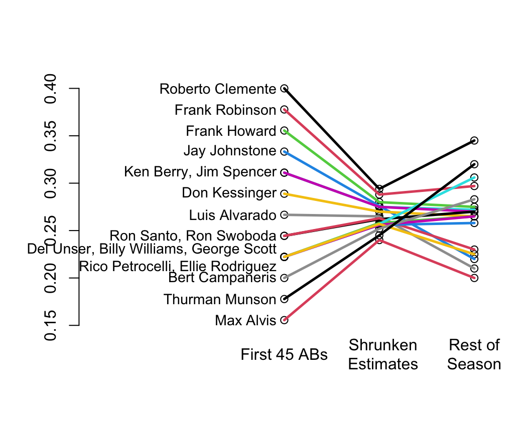
Classic paper on shrinkage: @efr77ste
* Shrinkage is a way of discounting observed variation that accounts for regression to the mean
* In their example you can see that the variation in batting averages for the first 45 at bats is unrealistically large
* Shrunken estimates (middle) have too little variation but this discounting made the estimates closer to the truth (final batting averages at the end of the season)
* You can see the regression to the mean for the <em>apparently</em> very hot and very cold hitters
```{r w=5.5,h=4.5,bot=1,left=-3,rt=.5,cap='Initial batting averages as estimates of final batting averages for players, along with shrunken estimates that account for regression to the mean',scap='Baseball batting averages and regression to the mean'}
#| label: fig-change-baseball
nam <- c('Roberto Clemente','Frank Robinson','Frank Howard','Jay Johnstone',
     'Ken Berry','Jim Spencer','Don Kessinger','Luis Alvarado',
         'Ron Santo','Ron Swoboda','Del Unser','Billy Williams',
         'George Scott','Rico Petrocelli','Ellie Rodriguez',
         'Bert Campaneris','Thurman Munson','Max Alvis')
initial <- c(18,17,16,15,14,14,13,12,11,11,10,10,10,10,10,9,8,7)/45
season  <- c(345,297,275,220,272,270,265,210,270,230,265,258,306,265,225,
             283,320,200)/1000
initial.shrunk <- c(294,288,280,276,275,275,270,265,262,263,258,256,
                    257,256,257,252,245,240)/1000
plot(0,0,xlim=c(0,1),ylim=c(.15,.40),type='n',axes=F,xlab='',ylab='')
n  <- 18
x1 <- .5
x2 <- .75
x3 <- 1
points(rep(x1,n), initial)
points(rep(x2,n), initial.shrunk)
points(rep(x3,n), season)

for(i in 1:n) lines(c(x1,x2,x3),c(initial[i],initial.shrunk[i],season[i]),
                    col=i, lwd=2.5)
axis(2)
par(xpd=NA)
text(c(x1,x2+.01, x2+.25),rep(.12,3),c('First 45 ABs','Shrunken\nEstimates',
     'Rest of\nSeason'))
for(a in unique(initial)) {
  s <- initial==a
  w <- if(sum(s) < 4) paste(nam[s],collapse=', ') else {
    j <- (1:n)[s]
    paste(nam[j[1]],', ',nam[j[2]],', ',nam[j[3]],'\n',
          nam[j[4]],', ',nam[j[5]],sep='')
  }
  text(x1-.02, a, w, adj=1, cex=.9)
}
```
```{r echo=FALSE}
saveCap('14')
```